Building accessibility into our color systems and tools
In the summer of 2018 I expanded and updated our color system while keeping accessibility top of mind, making it easier for our product teams to ship products that met WCAG AA contrast requirements.
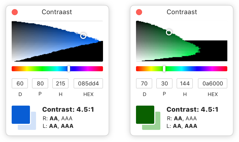
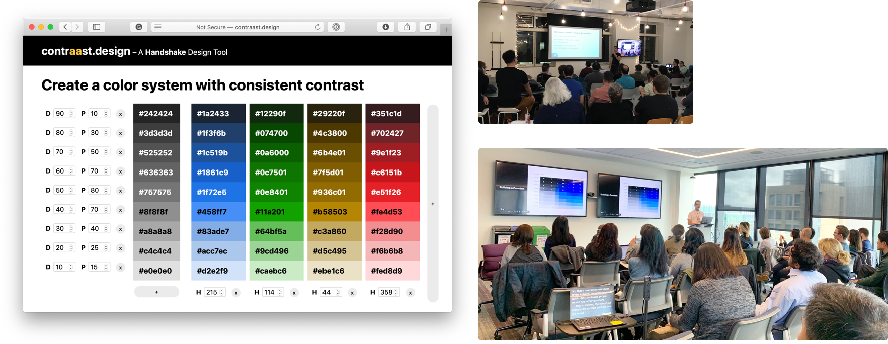
I ended up turning this work into a tool called contraast.design that allows other designers to use our approach for their own color systems–presenting my work at an A11yBay meetup, the 2019 Accessibility Camp in San Francisco, and on an episode of the Rubber Ducking podcast.
Updating our color system was our chance to put accessibility first
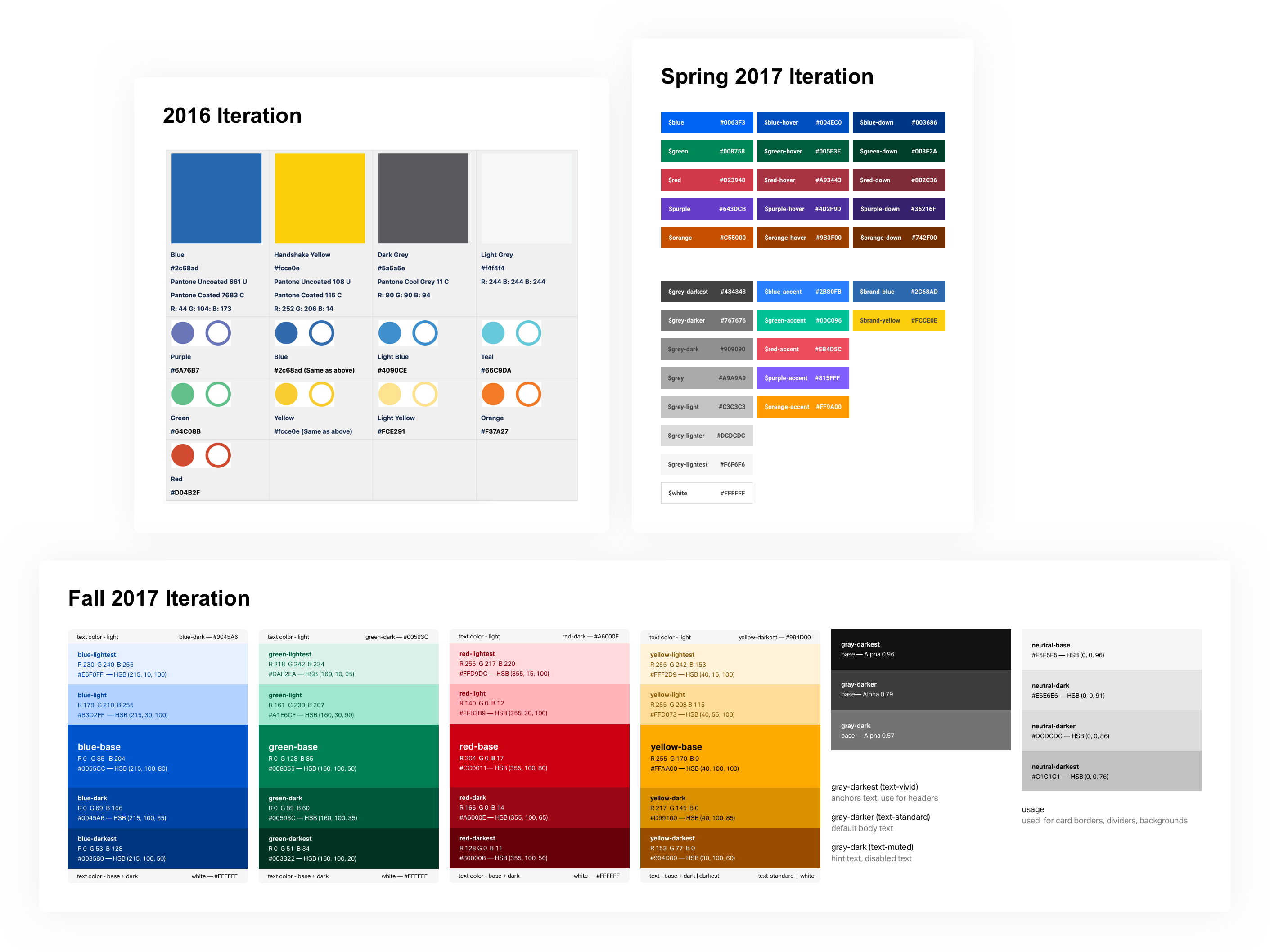
Throughout my time at Handshake the colors we use in the product have evolved multiple times as we iterated on the look and feel of our product and UI system.
In the summer of 2018 our design team recognized that our color system didn’t have all of the hues and shades we wanted to work with in our UI so we decided to update and expand our color system.
Since we were planning on making changes to our color system, I advocated for making sure our next iteration would make it easier to create and implement designs that passed accessibility standards.
Starting with an audit – what are we using color for today?
To start this project I audited our current products and documented how we used color at the time. I shared this documentation with the design team so we could evaluate an updated system through a common understanding.
After some discussion, we agreed we were using color to accomplish these 3 things:
- Direct attention – Color reinforced hierarchy and direct users’ attention toward specific UI elements and away from others.
- Reinforce meaning – Colors like red, yellow, and green layered on meaning in addition to other affordances like shape, copy, and iconography
- Communicate brand – Color injected a bit of joy and fun into the job search process, differentiating us from our competitors
Auditing our design and engineering processes – what does a good color system accomplish?
We knew how we’d used color in product. The next question we had to tackle was how should we design the system in a way that was useful for our designers and engineers?
I interviewed designers and engineers across the company and identified 3 core themes:
Make it easy to understand acceptable contrast
One of the most common questions that would come up during design reviews in our product development process was “Is that color accessible?”.
The underlying question there was actually “Does that combo of background color and foreground text/icon color meet WCAG AA contrast requirements?”. Getting the answer to that question likely required a designer to open up a contrast checking tool and check it manually.
Solve for real use-cases
One common theme I heard from interviews with engineers was that the color variables we had previously defined didn’t seem to line up with real use-cases.
Our previous color stacks looked nice as a system, but weren’t consistently used across component variants and states, resulting in many edge cases that forced us to introduce new colors that weren’t part of the system. This led to more fragmented code and designs.
Allow for evolution
At this point in Handshake’s design history we didn’t have intentional brand guidelines or visual design direction. Our brand would be evolving in the future and we would need to adjust the colors we used. In an ideal world we could make those adjustments without impacting color contrast in the UI.
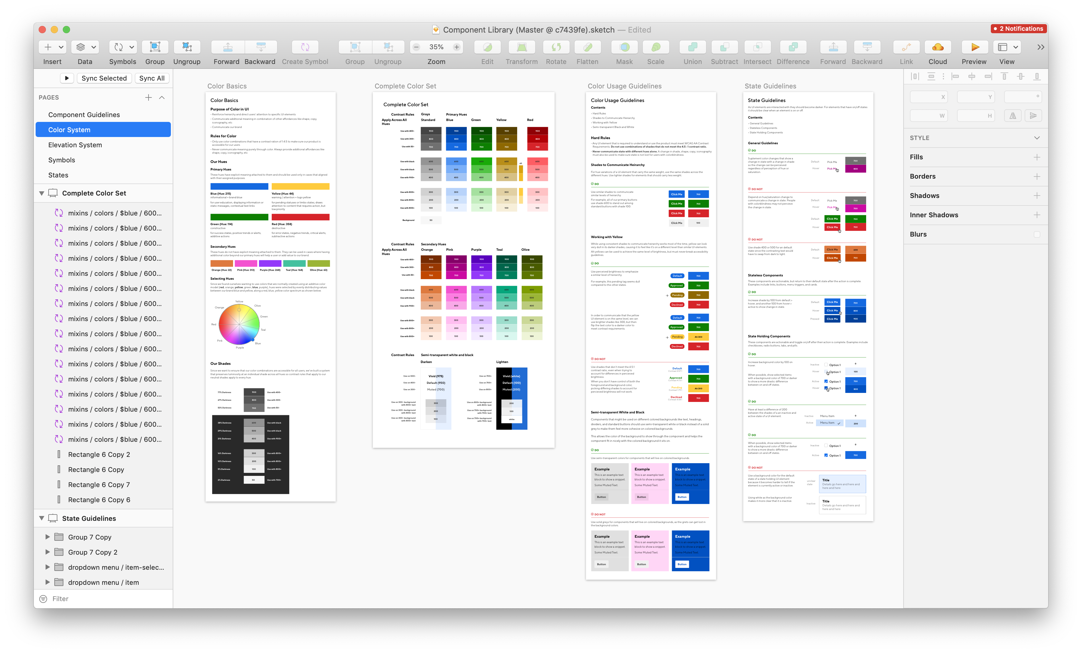
Building our “perfect” color system
With these themes in mind I sketched out some frameworks of what our ideal system might look like.
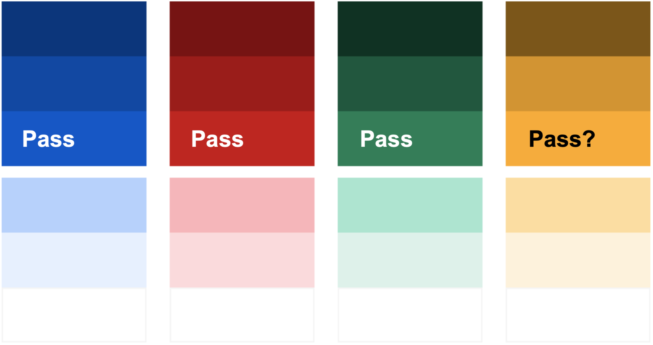
I imagined a world where the you could tell if two colors had high enough contrast simply by looking at the levels of the two colors.
Since future brand updates would likely result in new hues, I challenged myself to turn this into a tool that would allow us to adapt to that without much manual effort.
I spent my nights and weekends experimenting and building this tool
I was so excited about trying to make this tool work I spent the next weekend heads down at a coffee shop. I read about the math used to calculate color contrast and how to convert from one color space to another. Eventually I put together a tool that took in contrast levels and hues and output colors that all had the same contrast properties.
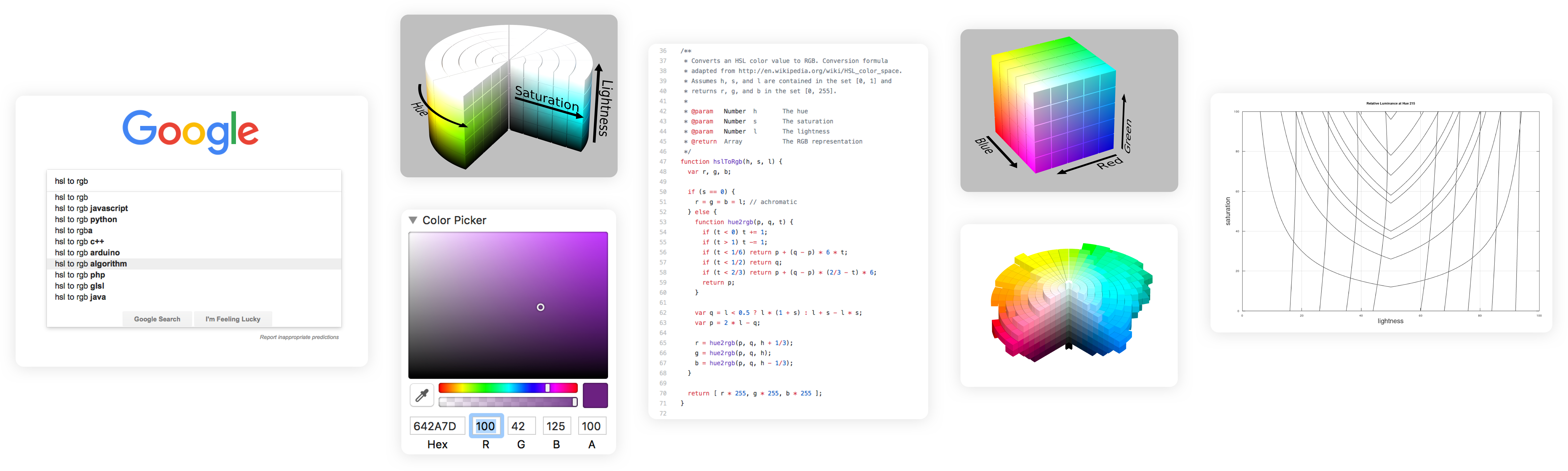
Along the way I learned what terms like “relative luminance” meant, how different hues have different relative luminance properties as they get lighter or darker, and how some hues aren’t physically capable of being as bright when they get lighter or darker.
I won’t go into all of the details here, but you can check out the presentation I gave on the math and approach here.
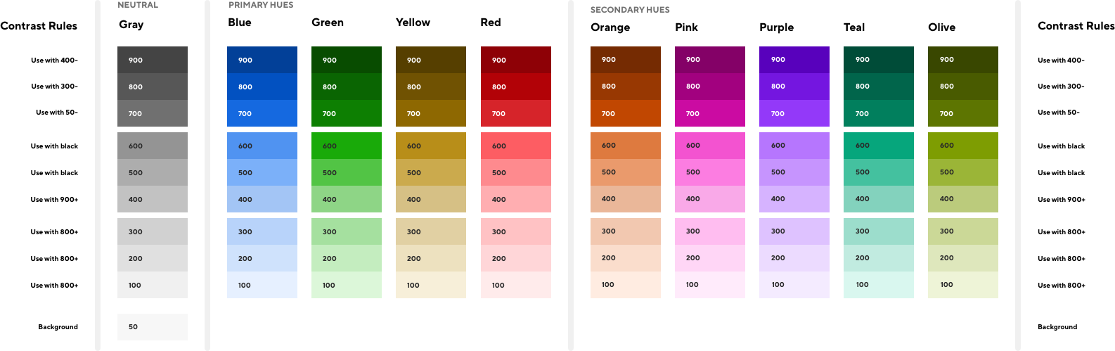
Next, I used the tool to create our color system. There were 3 main decisions I needed to make:
- How many levels of contrast do we need, and what should those levels be?
- Which hues do we want to support?
- How bright do we want the colors to be?
Determining necessary levels of contrast
To determine how many levels of contrast we needed, I took screenshots across the product and converted them to grayscale. This showed me that we were using about 9 levels throughout the product.
Choosing hues
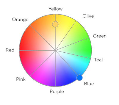
Over the previous few months designers had tried using teal, purple, orange, and a few other hues that were not in our current color system.
Since we only had two official brand colors at the time–blue and yellow–I decided to distribute the additional hues around our brand colors on a color circle to make sure they were as different from each other as possible.
Choosing brightness
Since we used color to inject some joy and playfulness into our product, I picked the brightest options possible.
Plugging these colors back into our UI surfaced a problem with this approach. Since some colors aren’t physically capable of being as bright as others, parts of the UI like the green alert shown appeared to glow compared to others.
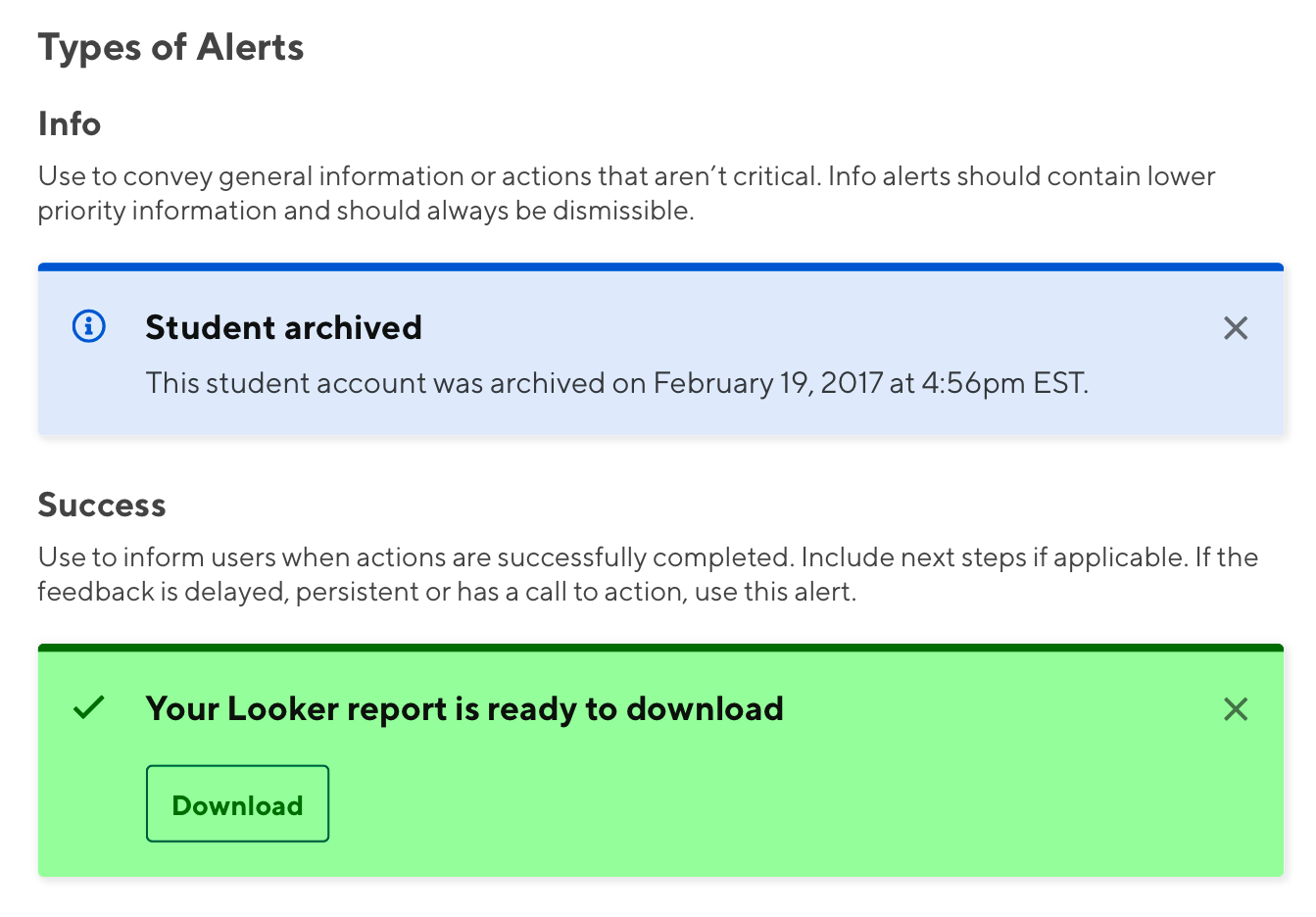
To prevent this I picked the max brightness levels of our blue hue and capped the rest of the colors there.
Testing with the design team
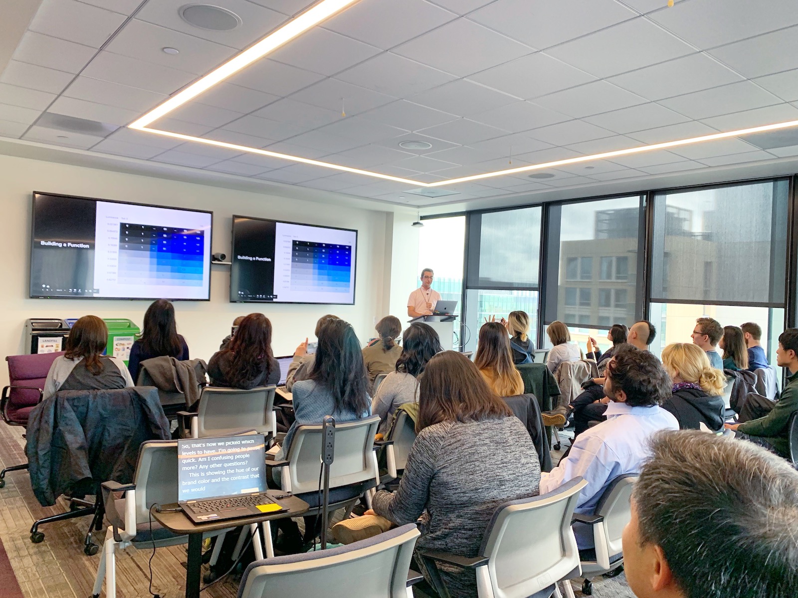
Now that I had what I thought was a perfect set of colors, I wanted to make sure the design team had an opportunity to test them out to catch any issues before we actually updated them in the product.
I paired with each designer on the team, asking them to use the new colors in their work, and documenting any questions they had along the way.
After pairing with everyone I made some tweaks to the system to account for some colors feeling too bright or too dull, and turned their questions into an initial set of documentation that would live alongside the system.
Updating the product to use the new colors
To say I was proud of this new system would be an understatement. I was so excited about solving this problem and getting these new colors in our product so our team could start using them to build more accessible features.
Proactively communicating the changes
Before we started rolling out these new colors in the product, we needed to make sure the engineering team knew how to use them while building new features, and that customer support team was aware so they could respond to any issues our users flagged.
I was invited to do a lunch and learn with the engineering team to bring them up to speed. I gave them context on how we use color on the design team, why we needed to make these changes, and geeked out with them about the math behind the new system. They were excited!
I partnered with a member of our support team to write up some documentation about the changes, emphasizing how these changes would allow us to improve the accessibility of our products which was core to our mission.
Speeding up the implementation process by submitting my own code
From previous experience tweaking our color system I knew that implementing these updates in our codebase would require manual review and answering quite a few open design questions. Instead of pairing with an engineer and using their time, I got my own local version of our codebase running on my laptop (after a bit of struggling and pairing) and submitted pull requests for review that only required a small amount of engineering effort to review.
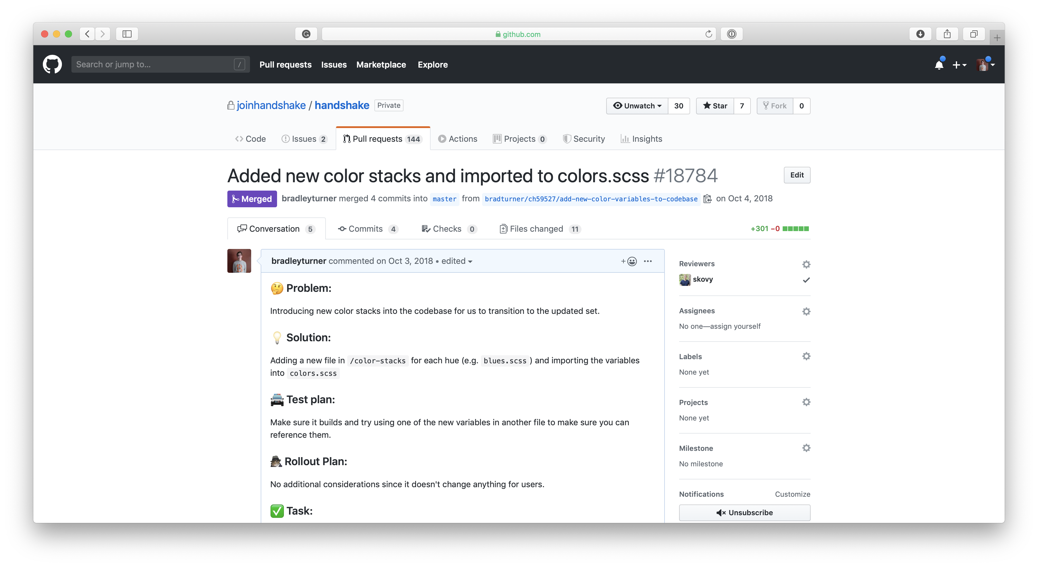
When I encountered old UI that used previous 1-off colors or inaccessible color combinations I partnered with the PM and Designer that owned that part of the product to update the UI to use our new color system effectively.
The end result included product, system, and process improvements
When the design team initially decided to expand our color system we were focused on improving our ability to ship the designs we wanted to. By advocating for embedding consistent contrast ratios in the system we ended up with clear rules that made it easy to ship UI with accessible contrast ratios.
That system also made it easier for me to update old UI that wasn’t accessible, eventually allowing us to remove an outdated and poorly maintained feature in our product called “High Contrast Mode”.
This was an old fix for meeting accessibility audits that allowed users to toggle on a separate stylesheet that darkened some colors. Now that the entire product had accessible color combos, users with low-vision had a first class experience instead of having to dig into our settings to turn on a toggle that made the product usable for them.
Removing this outdated feature also removed the need for a duplicated set of stylesheets, speeding up build times for the entire engineering team.
Sharing my approach with the accessibility community
After sharing my approach internally I was encouraged to make a public tool that would allow other design teams to take a similar contrast-first approach to their color picking.
I picked up my outdated React knowledge and built a minimal version at contraast.design, presenting my work at a Bay Area Accessibility Meetup and at the annual Accessibility Camp in San Francisco.
The community is taking this further
Since I worked on this, more designers and engineers in the community have built color systems that put accessibility first and allow for more fine-grained control of the colors you choose.
Most of these systems allow you to vary hue slightly as you change levels to make your chosen colors feel less muddy or muted, which my approach didn’t account for.
We can make color contrast top of mind for all designers
In the future, I’d love to see these systems evolve to be embedded in the tools we use today like Sketch and Figma. Instead of needing to trigger a plugin that checks contrast, imagine if our tools told us up front when our UI might be inaccessible for users with vision impairments.