Losing our focus while improving our new user experience
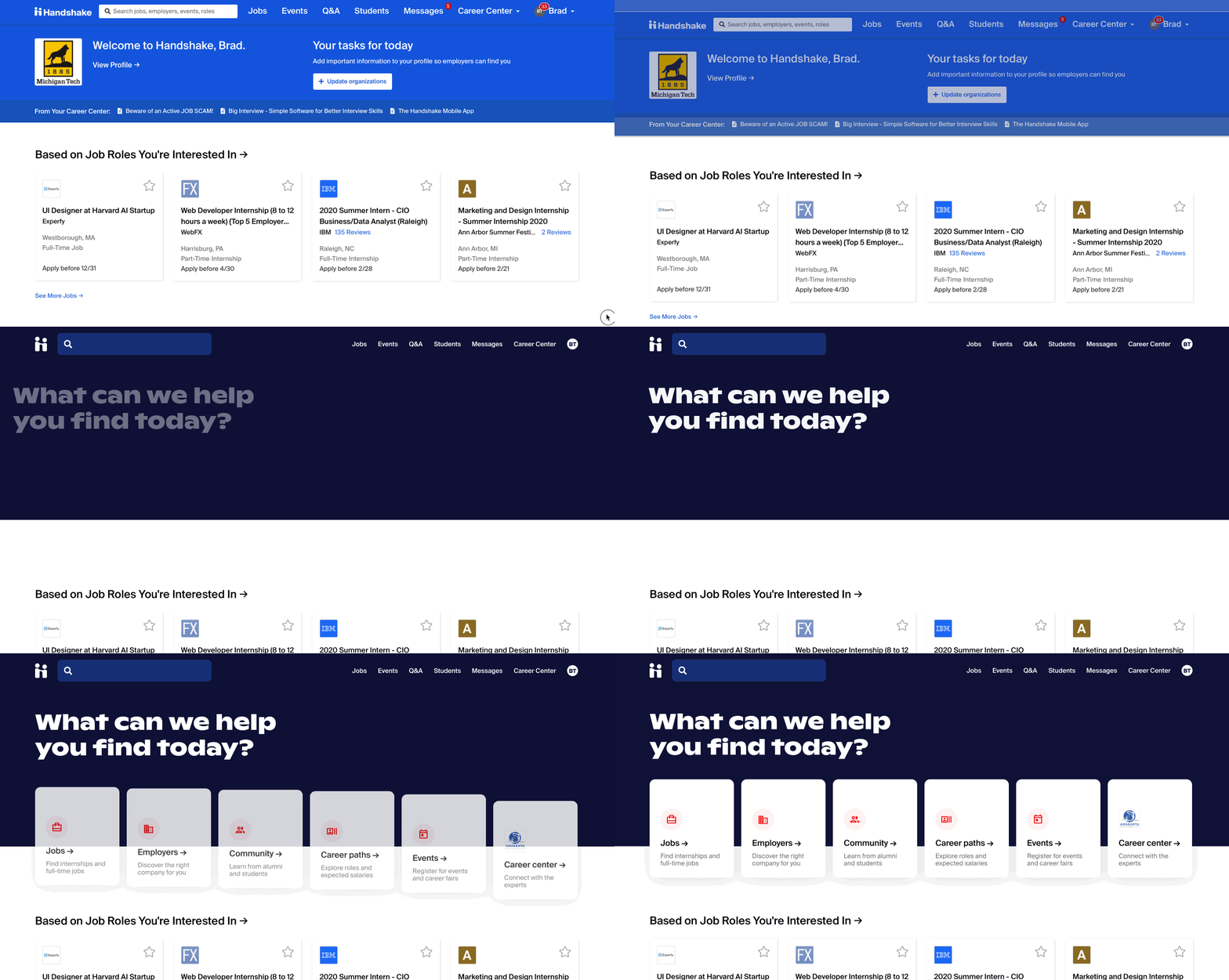
In the Fall of 2019 I worked on increasing student retention by focusing our new user experience on getting students to see relevant content on their first day.
I led the design process for our web, mobile web, and iOS platforms, collaborating closely with Product, Engineering, and Design partners along the way. At one point, we got so excited about solving a problem that we got distracted from our real area of opportunity…
We started with a student retention problem
At Handshake, our mission is to enable all students to build meaningful careers by helping them find their first jobs.
We do that by providing a personalized experience that helps students navigate all the job postings, employers, events, resources, and information they need regardless of who they or their parents know.
This only works, however, if students actually use our product throughout their career search. Unfortunately, many of our student users sign up, perform a few basic actions on our platform, then drop off and never return.

It’s safe to assume that we’re providing these students little-to-no value in their career search.
Retained students were viewing valuable content on their first day
When I first learned about these stats I wanted to know what returning students, i.e. those who are active beyond their first day on our platform, were doing during their first day that others weren’t. And if we could answer that question, could we possibly influence more students to take those actions?
I partnered with our data scientist to dig into this. We studied correlations between common first-day actions–such as completing different steps of onboarding or interacting with jobs and other content–and retention and applicant rates. Along the way, we exchanged ideas and hypotheses about why certain first-day actions might influence a student to return or eventually apply to a job.
This analysis resulted in 2 main takeaways:
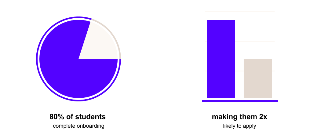
Only 80% of students finished our onboarding flow, and those that did were 35% more likely to come back and 2x likely to eventually apply to a job than those who did not.
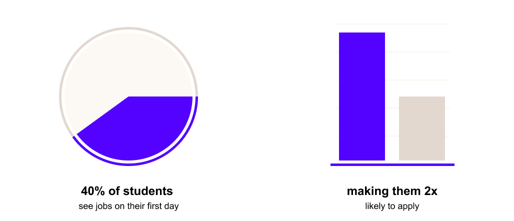
Only 40% of students who finished onboarding also viewed jobs on their first day, and those that did were 2x more likely to end up applying.
With these takeaways in mind, I audited our current experience to understand what might be causing first-day students to drop off before seeing jobs.
Our new user experience was not focused on getting students to jobs
Our onboarding flow was bloated with questions related to other business initiatives
Our onboarding flow was long, asking students 10 questions before we actually showed them what we had to offer, causing 20% of the students that signed up never to see our product.
These 10 questions supported initiatives across 3 separate product teams that all wanted student attention:
- The Connections Team wanted students to make their profiles public so that we could support our peer messaging feature to help students learn from each other
- The Guidance Team wanted to know what types of jobs students were interested in so we could recommend them relevant jobs
- The Employer Team wanted students to fill out their experience and make their profile public so employers could proactively recruit them
First day traffic was all over the place, suggesting lack of focus for students
Students who made it through our onboarding flow found no clear path for them to take beyond the home page.
In fact, we discovered that 15% of those students never took any action. The rest spread out their browsing across jobs, profile, notifications, and more. Looking at the current UI, I attributed this to multiple competing CTAs and overwhelming navigation at the top of the page.
How might we shorten or remove the onboarding flow?
One of the biggest problems the team wanted to solve was removing friction from the onboarding flow so more students would make it to our product in the first place. We knew the experience became more and more bloated over time and were excited about fixing it.
While the team was excited to tackle this problem, looking back on the initial data analysis we were only losing 20% of students in the onboarding flow, and we were losing 60% of students after onboarding before they got to jobs.
I spent about a week exploring this solution space before we decided to refocus on trying to solve the post-onboarding traffic issue on the homepage, resulting in concepts and insights that were only tangentially useful.
To tackle the challenge of removing some of the onboarding questions, I started by grouping them into these 3 categories based on what value the students got by answering the questions:
- You’ll get more relevant recommendations if you tell us what types of jobs you’re interested in
- Employers will proactively reach out to you when you fill out your profile and make it public
- You can message your peers about career-related questions when you make your profile public
After that, I explored multiple concepts that surfaced those value props and collected the related information throughout the students experience.
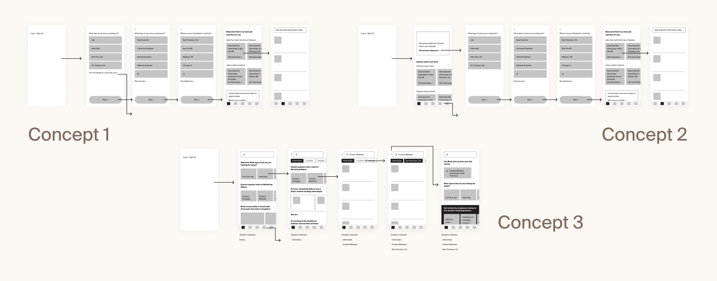
We tested the concepts with students to gut check our approach
After reviewing these concepts with stakeholders we came up with a list of assumptions we wanted to test before committing to one direction:
- If we remove the questions that help us initially personalize the student experience, will students perceive Handshake as more or less relevant?
- If we instead ask those 10 questions at later points throughout the student experience, will students still answer those questions?
- Would students be surprised or confused by not having an explicit onboarding process?
We tested 2 concepts to allow students to compare their experiences
I conducted remote user testing sessions with 6 students, starting by asking them about their previous experience searching for jobs and then having them click through 2 prototypes, digging into their experience as they went.
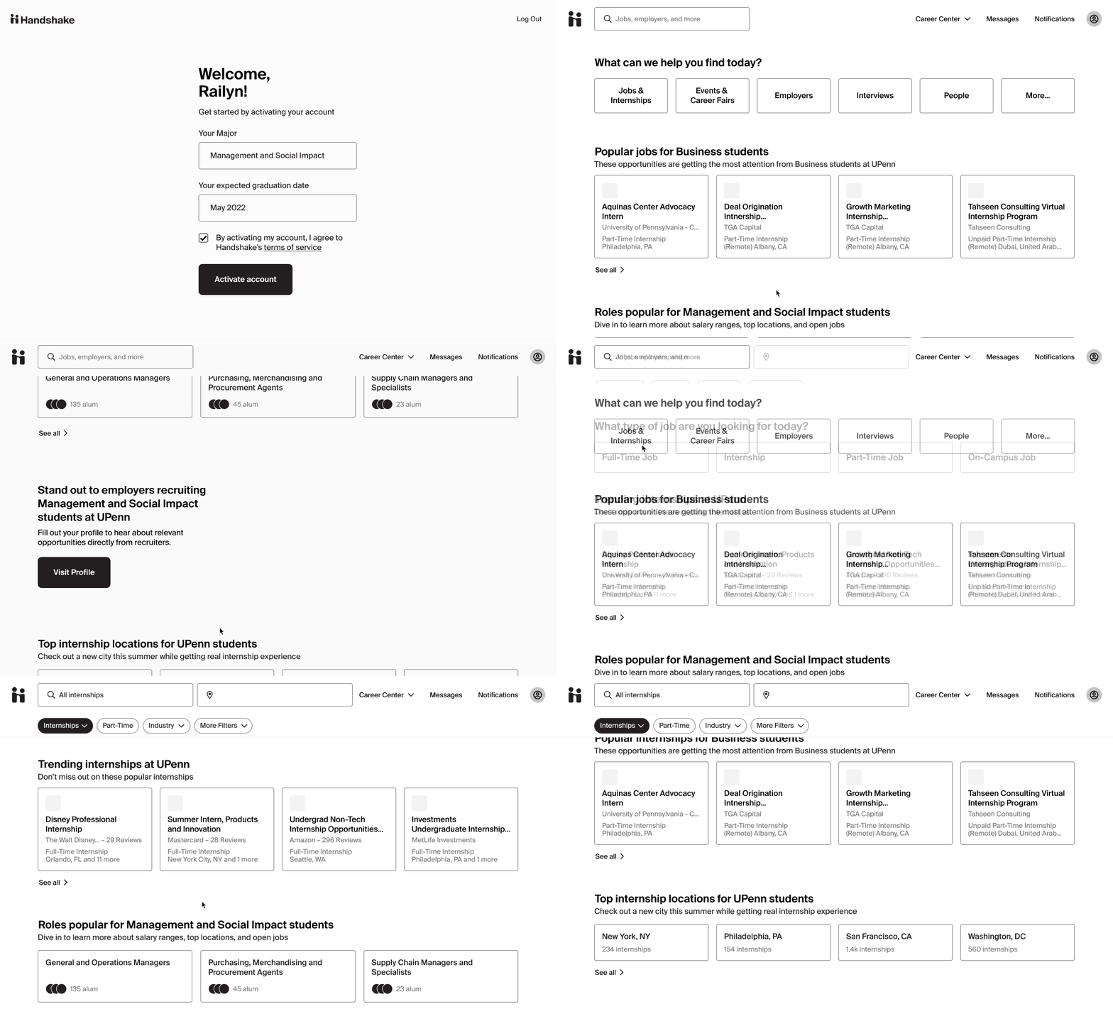
One prototype had a shortened onboarding experience that asked students their job preferences before showing them the product. The other dropped them right into the product with the ability to explore in whatever way they saw fit. We alternated which prototype we showed them first so that we didn’t bias their experience by always starting with one version.
We felt confident moving forward with a version that didn’t include onboarding
Overall the version without the onboarding survey had better results. Students still felt like Handshake was relevant, were inclined to fill out the 10 questions later on, and only one student mentioned that they were surprised by not having an introduction before getting dropped into the product.
Students who didn’t know exactly what they were looking for got stuck on some of the questions in the onboarding flow, and didn’t encounter the same friction in the version without the onboarding questions up front.
While we weren’t explicitly testing the layout of the home page, we heard from many students that they felt overwhelmed by all of the different types of content we presented them with in the prototype which was a good reminder of our need to focus their attention on day one and not overwhelm them.
We had a big concept to work toward. Next we needed to break it down.
We felt confident about moving in a direction that introduced value props throughout the student experience and allowed students to more easily find the type of content they were looking for, but we would need to build quite a bit of new functionality throughout the product to support this concept and remove the current onboarding experience.
We refined this direction to feel less overwhelming and presented a prototype to the iOS and web engineering teams, discussing how we might separate the work into deliverable pieces, resulting in this breakdown:
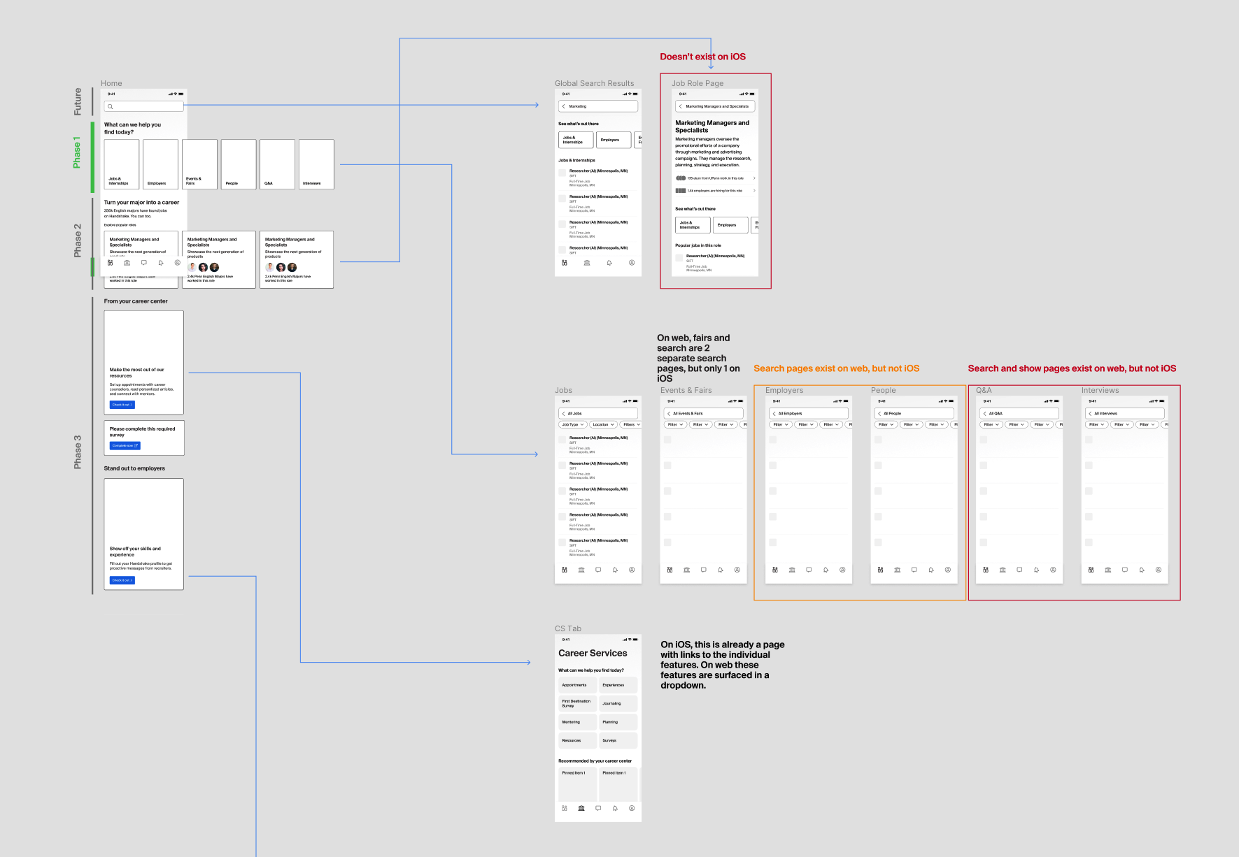
- Content type navigation – surface the core types of content in a digestible manner at the top of the home page, allowing students to pick their path if they know what they are looking for
- Job role exploration – for students who don’t know what type of job they are looking for, start to surface career paths they might be interested in
- Home page prompts – start to set us up to introduce the concept of getting proactive messages from employers by building out our first home page prompt
When reviewing this plan with the VP of Product, he pointed out that the unfocused homepage experience seemed like a bigger problem than the onboarding flow and encouraged us to focus on the content type navigation since that was more likely to solve that problem.
This might have been a good opportunity for us to take a step back in order to explore and test some new concepts focused on directing students to jobs from the home page instead of trying to remove the onboarding friction.
We were trying to meet a 2 week product definition timeline so we decided not to take another week for additional exploration and testing, resulting in more uncertainty about whether this solution was the right one.
Nailing the UI for content type exploration was an opportunity to incorporate new branding
While exploring UI options for these 6 cards at the top of the page, I ended up collaborating with our Director of Design, Student Design Lead, and our iOS Product Designer.
We were simultaneously tasked with incorporating a new corporate brand into the product and this was the first project to test out some of those ideas. Overall we tried hundreds of options; playing with size, color, shape, imagery, you name it.
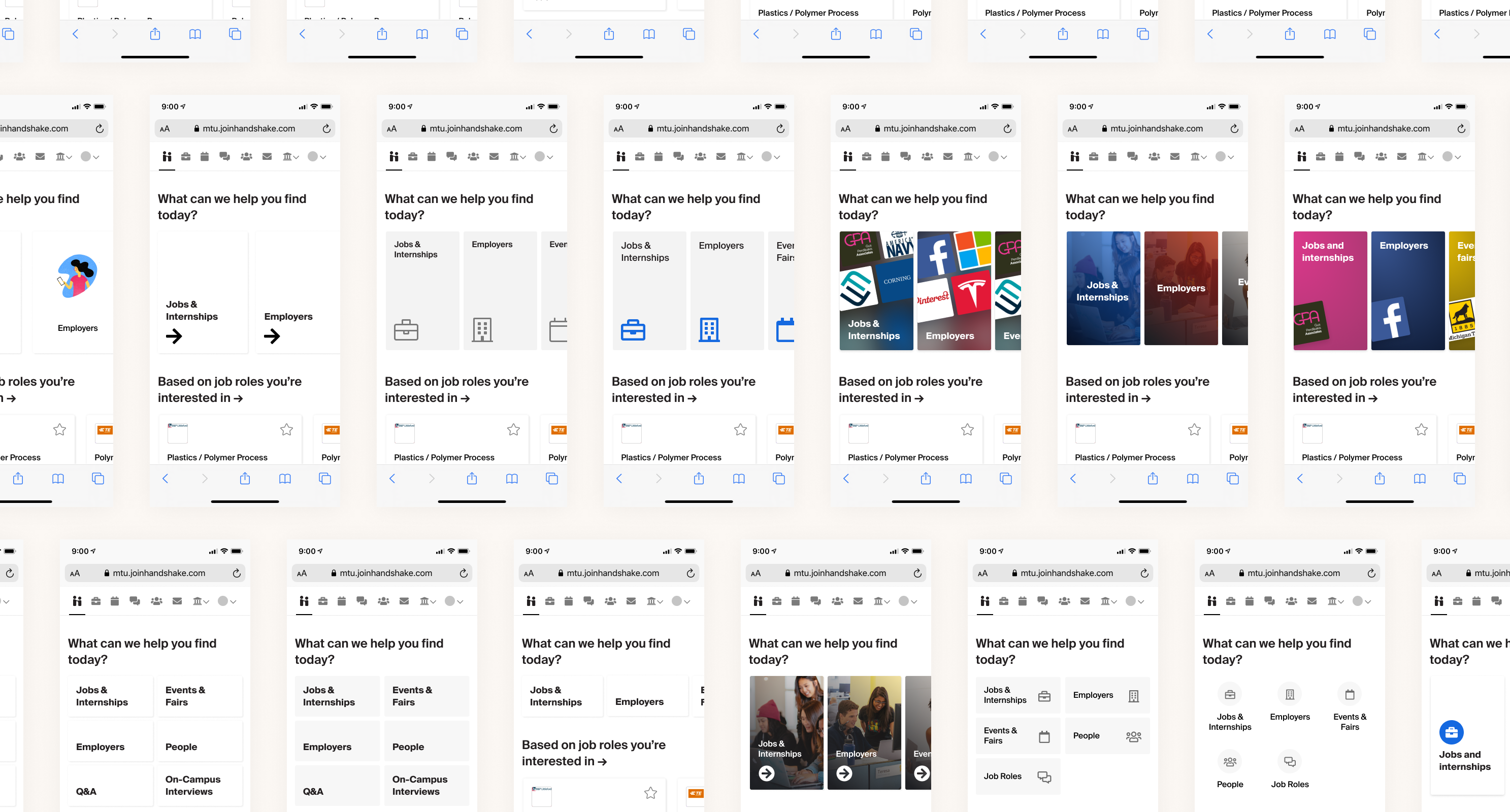
In the end, we wanted something that differentiated us from other job search platforms students might be using. We also wanted to make sure the content types were clear and were the focus of your attention when you landed on the home page.
Because of these reasons, we opted for a simple card with the content title, a short description, and a supporting spot illustration that didn’t distract from the actual title. We set these cards on a deep blue background to draw attention to them without making the UI feel overwhelming.
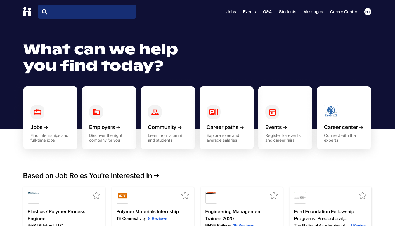
This direction also required us to tune the styling of the main navigation bar to allow the content type navigation on the home page to stand out.
After we found a direction we thought was most successful, I spec’d out the UI details to make it easier for the engineering team to implement the new styles we were introducing and fine-tune the responsive behavior.

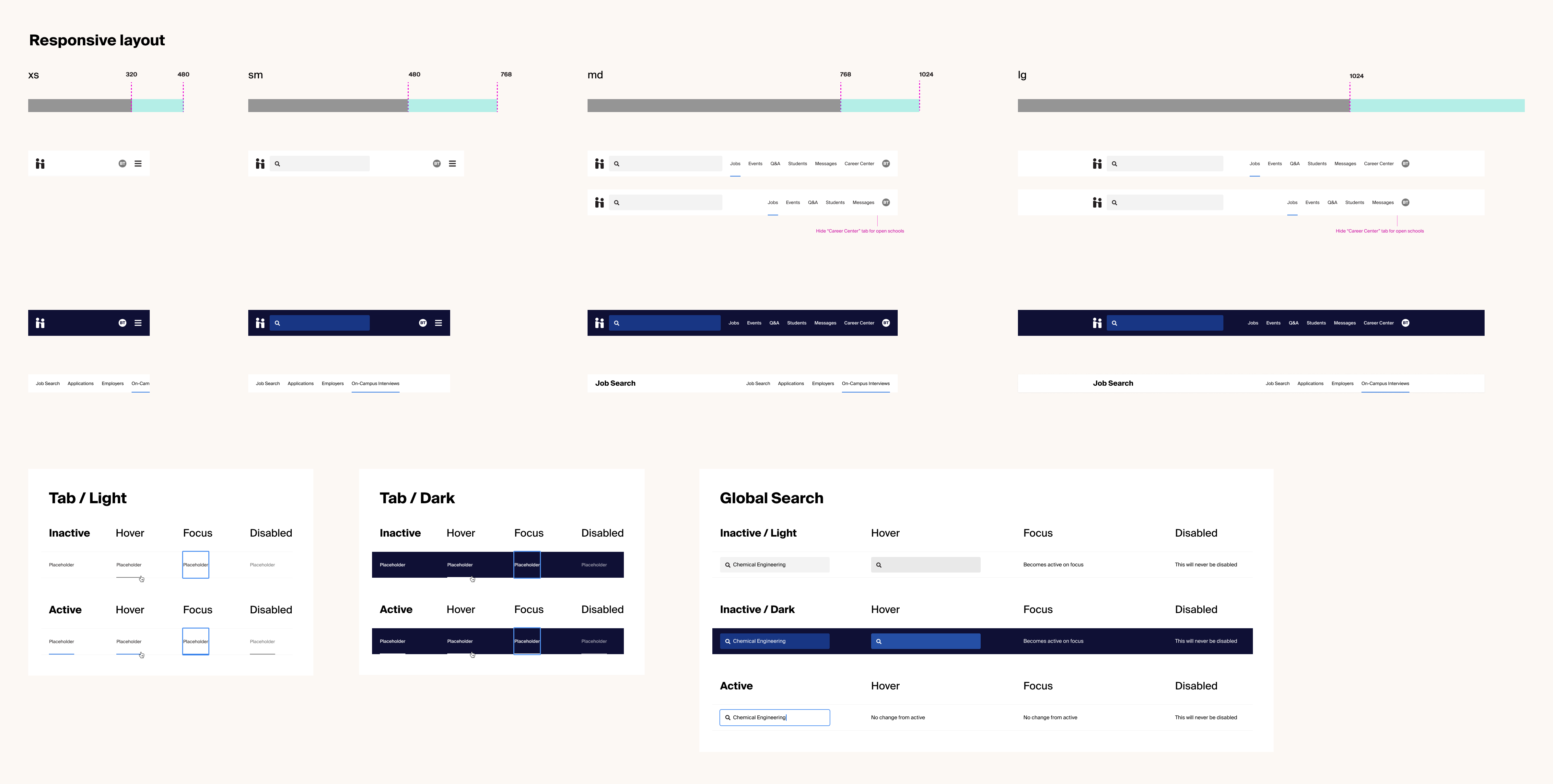
This project ended up having tons of explorations and quite a few new component design drafts and specs in Figma which were proactively shared out with the engineers along the way.
When it actually came time to implement the final UI, I got feedback from engineers that they were struggling to keep track of what version they should be implementing so I ended up tackling a mini design project to make a Figma template to make this handoff easier in the future.
Adjusting our focus will help more students throughout their career journey
We are currently A/B testing the first iteration of the content navigation on the home page to understand how it impacts first day traffic, retention rate, and eventual application rates.
While that’s being tested the team is picking back up the work to remove friction from our onboarding flow so our initial concepts and insights are coming in handy.
Working on this project was a great reminder of how the problems the team is most excited about solving aren’t always the ones that are having the biggest impact on the user experience.
I’m grateful that our team was able to catch that in the design process and refocus on what we believed would be most impactful before spending too much time refining and building a different experience.
