Reflecting on one year of designing for Parkinson's research
After 4 years designing products to help college students find jobs, I joined Blackfynn to apply my experience to an entirely different problem space: Parkinson’s Disease research.
I quickly realized just how much I had to learn about this new industry when I was introduced to my first project:
“Your first project is going to be updating our LEDD ConMed Log so that researchers can collect a standard calculated daily dose of levodopa equivalent medication for each patient by providing a curated list of medications like carbidopa/levodopa, amantadine, benzotropine, etc.”
That project kicked off a great year at Blackfynn. I learned about a brand new problem space, applied my past experience to a new team, and continued to expand my skillset as a designer. While I worked on many projects, I’ve highlighted three of my favorites below.
Correcting my assumptions about how people with Parkinson’s Disease experience technology
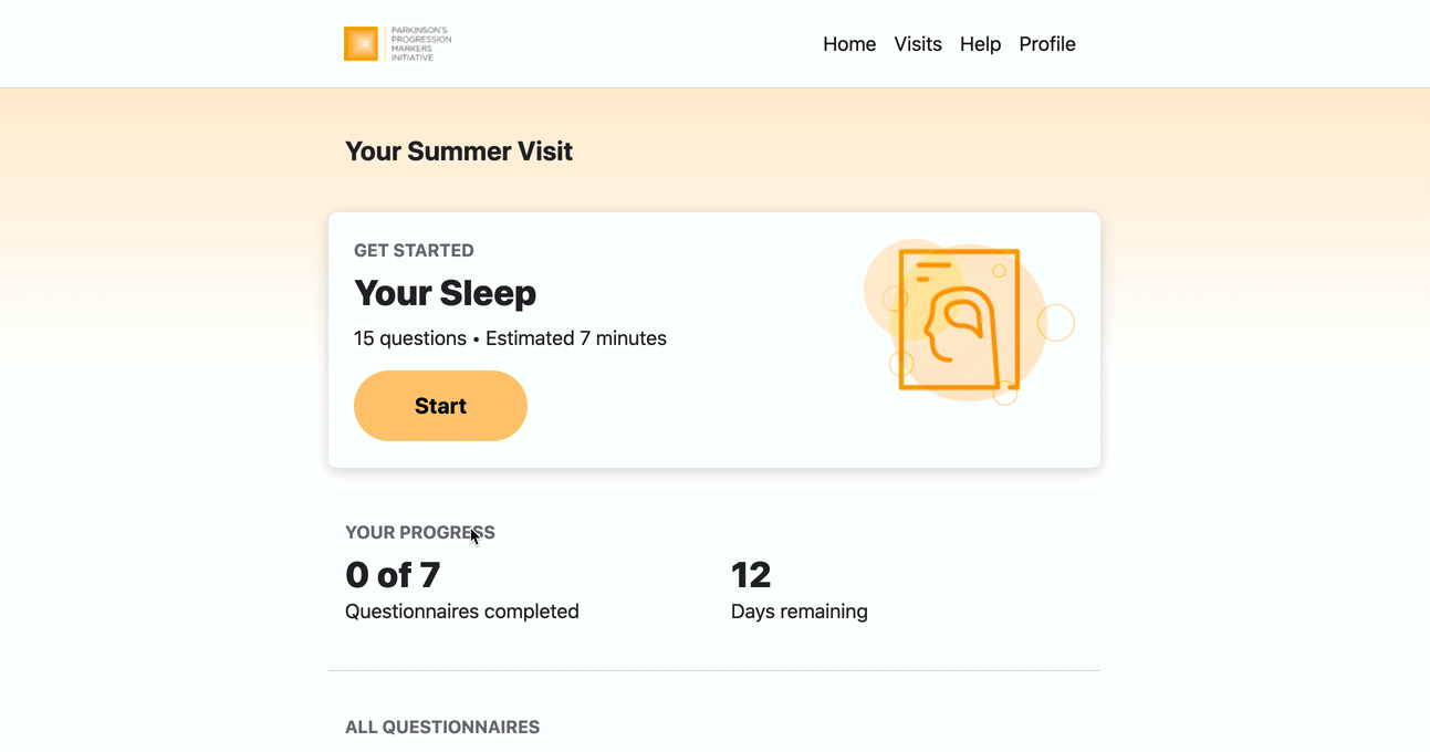
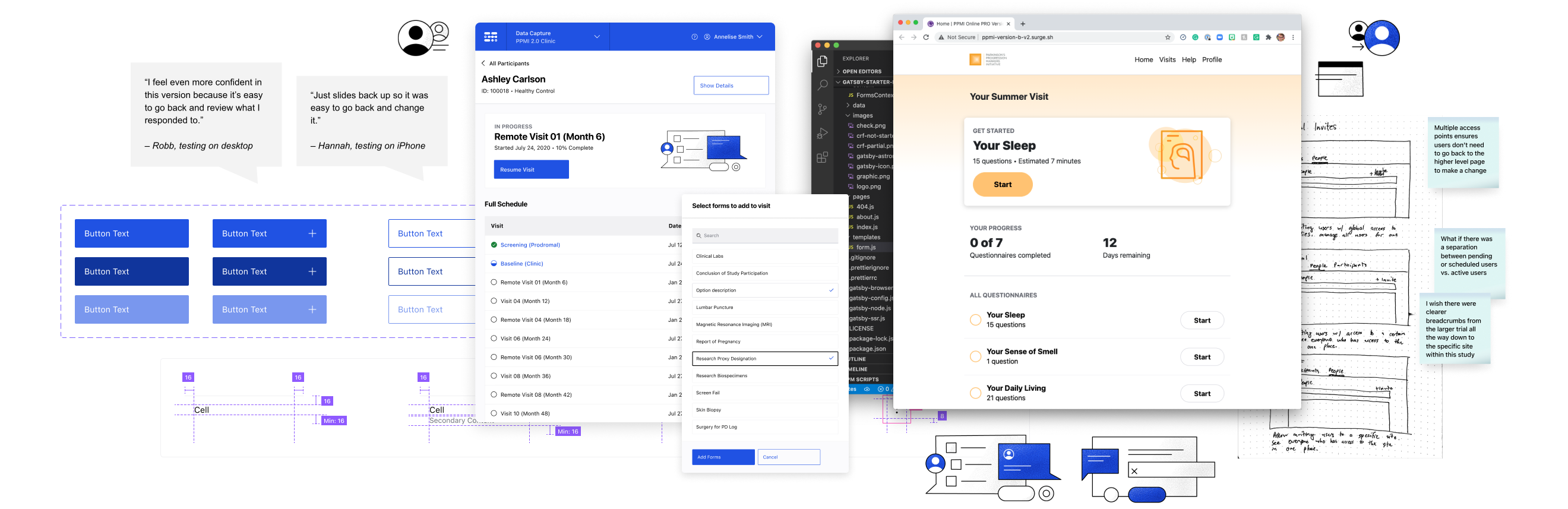
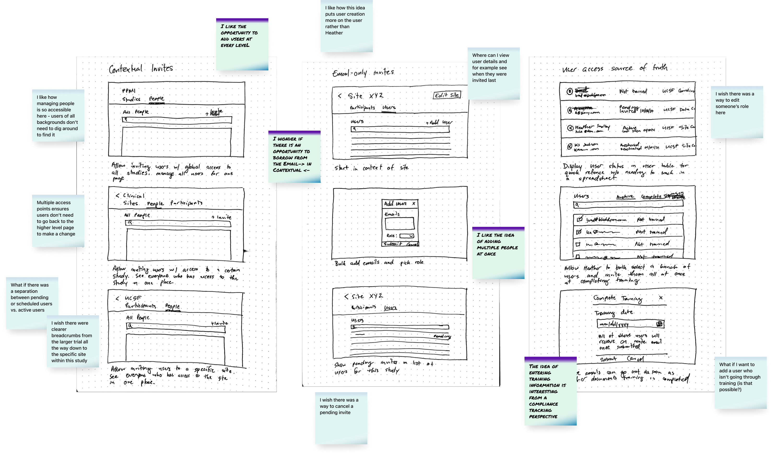
 One of my favorite projects I worked on last summer was designing a platform to engage up to 500,000 people in a digital Parkinson’s study.
I went into this project with a goal of prioritizing accessibility. Among other ideas, I assumed that minimizing scrolling would be helpful for people with Parkinson’s who experience a tremor in their hands.
By building prototypes and user testing with actual users, I learned that my assumptions were incorrect.
The core functionality for this digital health study platform was a set of multiple-choice surveys that participants would fill out every three months.
I assumed that navigating between questions by clicking a button would be easier for our users than scrolling between questions. To test this hypothesis, I built 2 prototypes in React and observed 6 users who tried out both options. One version allowed users to advance between questions by clicking a “Next” button, while the other allowed them to scroll to advance.
(I chose to use React instead of a more basic design tool to allow participants to select and possible answer and preserve their state. That would have been almost impossible to do in Figma.)
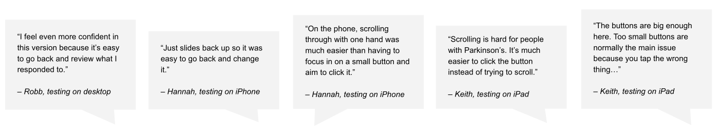
Some of our assumptions about accessibility were helpful, others caused frustration.
One thing we got right: Larger fonts and tap targets helped all participants use the product. Many participants specifically mentioned how much easier it was to use compared to other apps and websites they use today.
One thing we got wrong: Presenting one question at a time frustrated many participants. Constantly clicking “Next” felt unnecessary for many users and also made it challenging to go back and reference previous questions and answers since they couldn’t just scroll back up.
One additional insight: Having a tremor doesn’t automatically mean it’s hard for a participant to scroll. For example, one participant showed us that scrolling with their thumb while holding their phone was much easier than scrolling on an iPad perched on a table.
We corrected our assumptions and gained valuable insights for future projects
Conducting these user tests helped me check my assumptions about how to design products for people with Parkinson’s. I realized that constraining an experience to minimize scrolling was based on a bad assumption. Instead, we needed to acknowledge that scrolling could result in a few mis-taps here and there and we needed to make it easy for participants to check and adjust their responses.
While this project has been de-prioritized for the time being, we’ve been incorporating these insights into other participant-focused features and have continued to test our assumptions with additional user testing sessions.
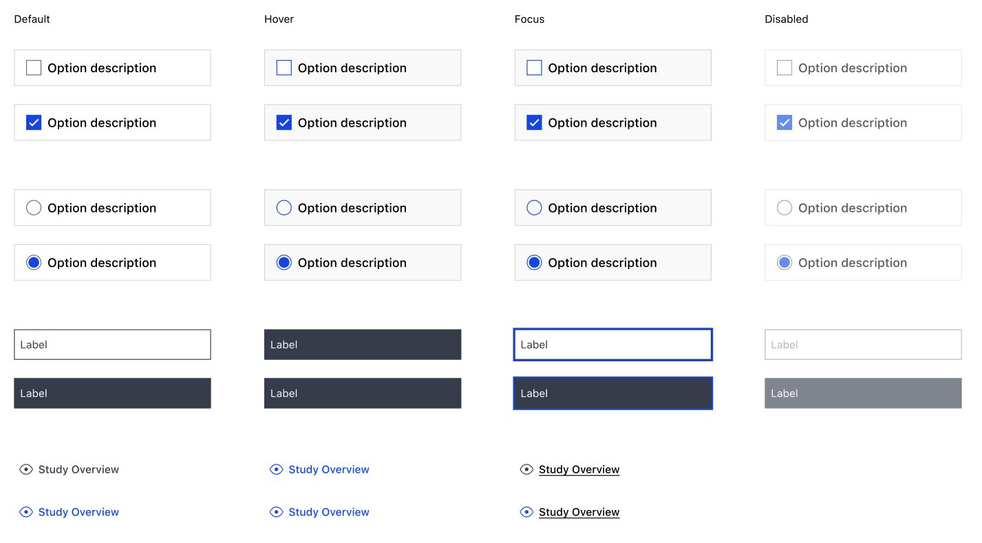
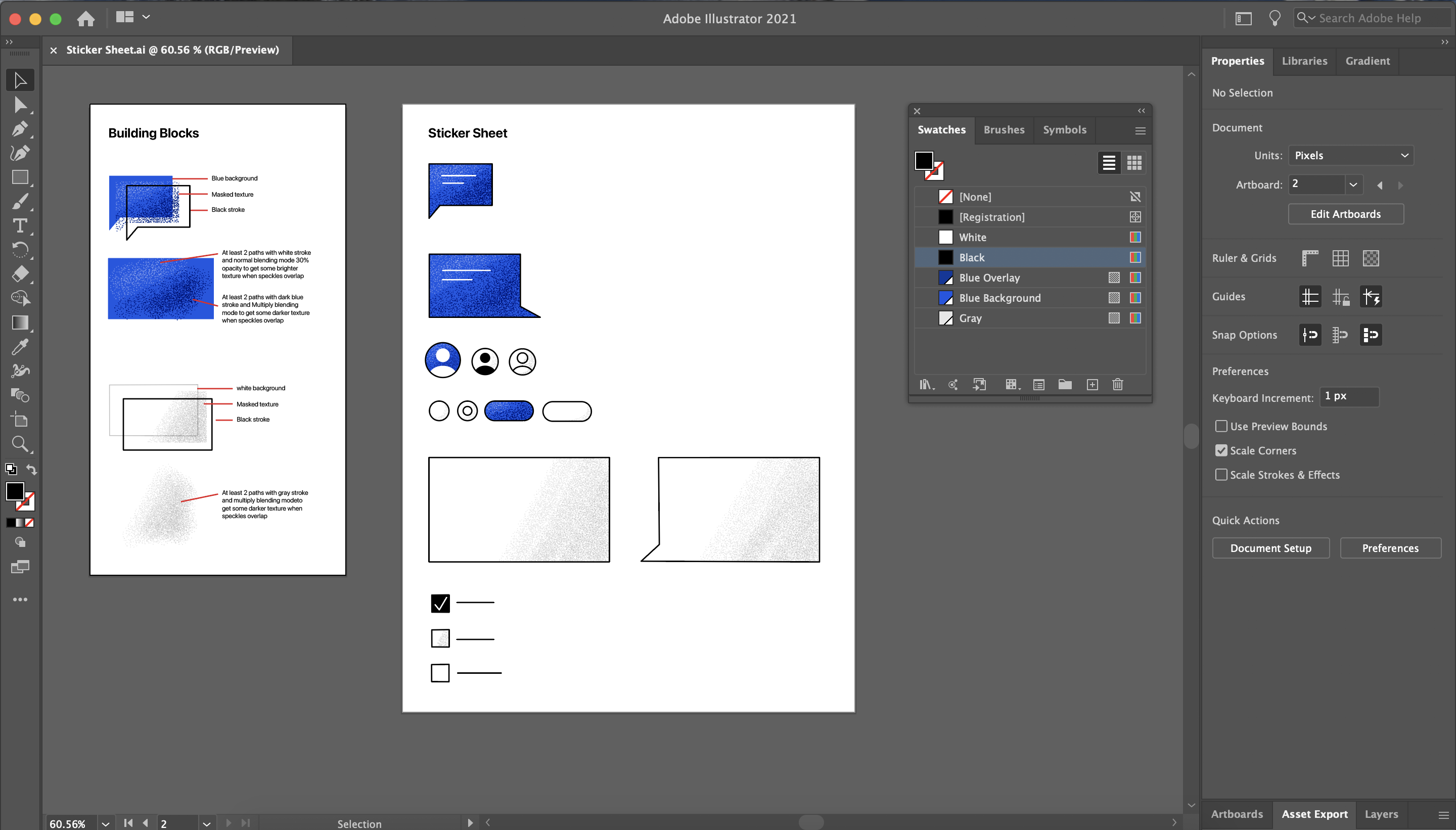
Improving design quality and engineering handoff with a Figma component library
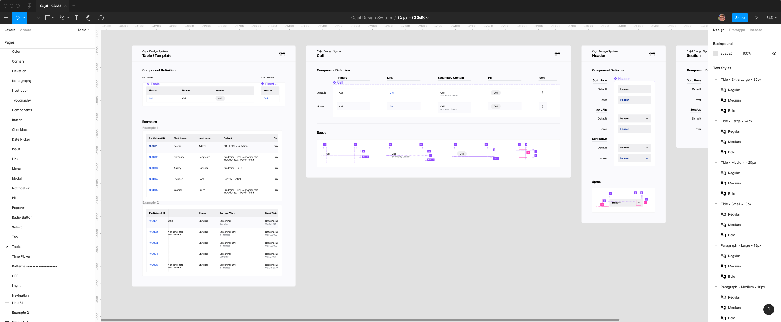
In addition to tackling core product projects, I worked on a variety of design process and tooling improvements. One of those improvements – establishing and maintaining our component library in Figma – has been a highlight of my time at Blackfynn.
Our design and engineering collaboration had some pain-points; Figma was the solution.
When I joined Blackfynn we were using a combination of Adobe Xd and Abstract to manage and share design files. This setup had a few issues, including styles and patterns that unintentionally varied between projects and files. This inconsistency caused confusion about what the current version was and whether the inconsistency was intentional.
When I was at Handshake, we solved this issue by using Figma’s component and style libraries. I worked with the team at Blackfynn to try out Figma and solve this problem by setting up a global style and component library as the source of truth in all design files going forward.
This library has already helped us create consistent, high quality designs, sped up our ability to produce mock ups, and improved engineering collaboration.
Now all of our projects reference this global style library and this library matches the styles of Vue.js components our engineering team uses. It’s cut down on a lot of confusion and created a consistent, high-quality product.
We supplement our design system with opportunities for exploration and evolution
When I was at Handshake, our design system was treated like a source of truth that should be followed at all times, leaving little room for evolution or exploration. At times, this got in the way of delivering the best experience for our users.
At Blackfynn, we set different expectations. We encourage exploration through activities like sketching before evaluating if our current system best serves our solutions. Sometimes we stick to the system and quickly deliver results. Other times, we expand the system and invest some extra time to best tackle new use cases.
Expanding my skillset while evolving our illustration style
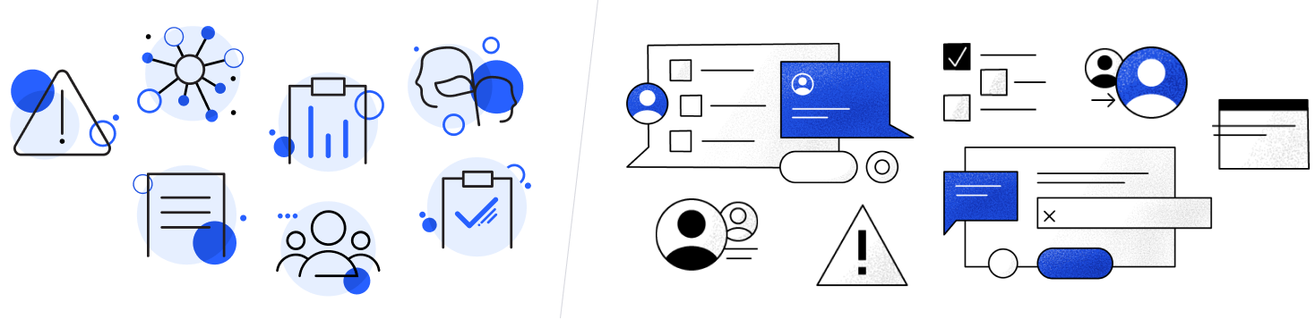
My favorite new skill I developed over the last year was illustration. Our illustration system was limited to small spot illustrations and didn’t solve for medium sized promotional content. I got to try my hand at illustration and evolve our system.
This was a great opportunity for to learn from peers and invest in my skills
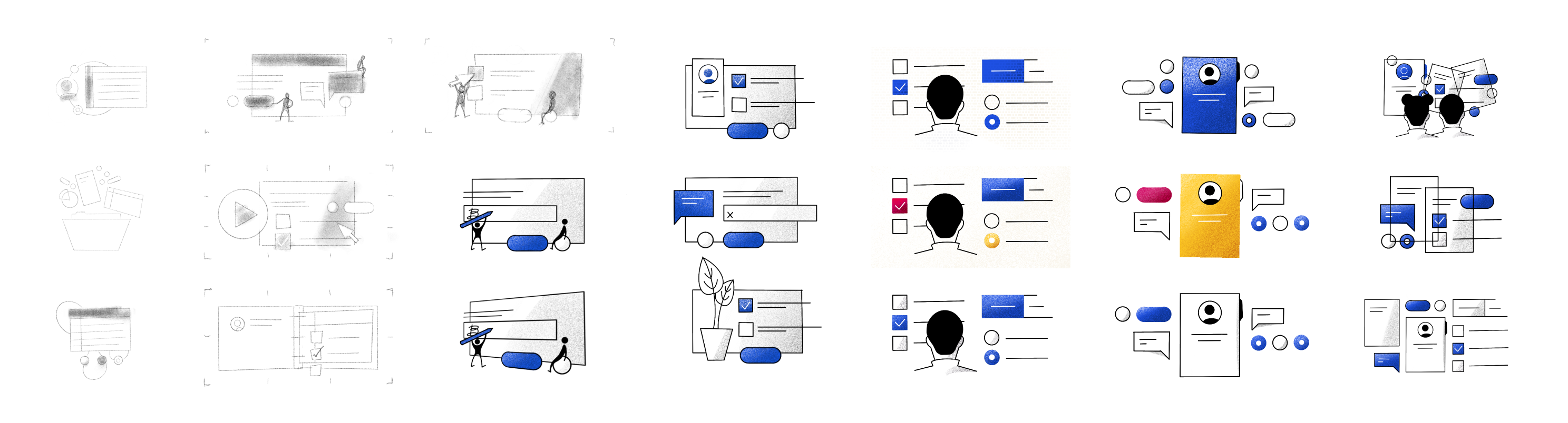
Working with the design team, I created moodboards for our styles, set some initial guidelines, and then started exploring. I used Procreate and Illustrator to explore a few different visual styles, and refined my approach after gathering feedback from the team.
We now have an illustration system that provides more depth while still maintaining our brand values.
As part of this project, I documented my approach and created templates for the team to use in future illustrations. In a sense, I re-applied some of my design system principles to illustration to make it easy for any member of the design team to create their own assets and expand the system.
I’m grateful for the opportunity to share my experience, grow as a designer, and contribute to the Parkinson’s research community
The past year has been incredibly rewarding. I learned about a brand new problem space, applied my past experience to a new team, and continued to expand my skillset as a designer.
In 2021 I’m looking forward to another opportunity to tackle a new set of challenges with a new team. If you’re hiring or if you want to work together on a project, feel free to reach out! I’d love to chat!